In Progress: Solo Exhibition of Kees Goudzwaard
Ways to Look at Goudzwaard’s Paintings
Author: Mu-Ning Huang / Institute of Art History at National Taiwan Normal University, Art Critic
When first seeing Kees Goudzwaard’s paintings, most audiences would mistake the works as collages made up of real papers and tape, deceived by the masterful trompe l’oeil effect. In truth, the paintings are 1:1 copies of paper models constructed by the painter. Goudzwaard’s creative act starts with the making of a paper model, using color papers, acetate sheets and masking tapes. After the model is set, Goudzwaard transfers the composition onto a stretched canvas with oil paints. Goudzwaard conceals his brushstroke so the surface of the painting appears smooth and thin. The painted image is precise in details and textures, testifying to the meticulous painting style. Goudzwaard has designed and followed this unique system of creative procedures for more than twenty years. The system engages with the questions of representation and abstraction, copy and originality, the painting as both a physical object and an image, and the relationship between reading and looking.
Representation and Abstraction
As many researchers have observed, Kees Goudzwaard’s painting harkens back to two distinct traditions: 17th Century Dutch art and early 20th Century abstract art. The former exemplifies the ability of painting to realistically represent the physical world, while the latter seeks to justify and discover the expressive value and meaning of colors, lines and shapes that do not refer to the physical world.
In the 17th century, the economy and the art markets of the commercial cities in the Netherlands flourished because of sea trading. There was Vermeer in Delft and Rembrandt in Leiden. Dutch painters were notable for depicting everyday scenes with subtle expressions of light and texture. Sub-genres of still life, such as “letter racks” and “back paintings” form an intimate dialogue with Goudzwaard’s works. A letter rack painting features letters pinned or tied onto a flat board. While sealing wax, quill, and penknife may also be present. A back painting, as the term suggests, depicts the back of the painting. While a still life painting testifies to the painter’s ability to render three-dimensional objects, both the letter racks and back paintings show off the painter’s skill of depicting thin and two-dimensional surfaces.
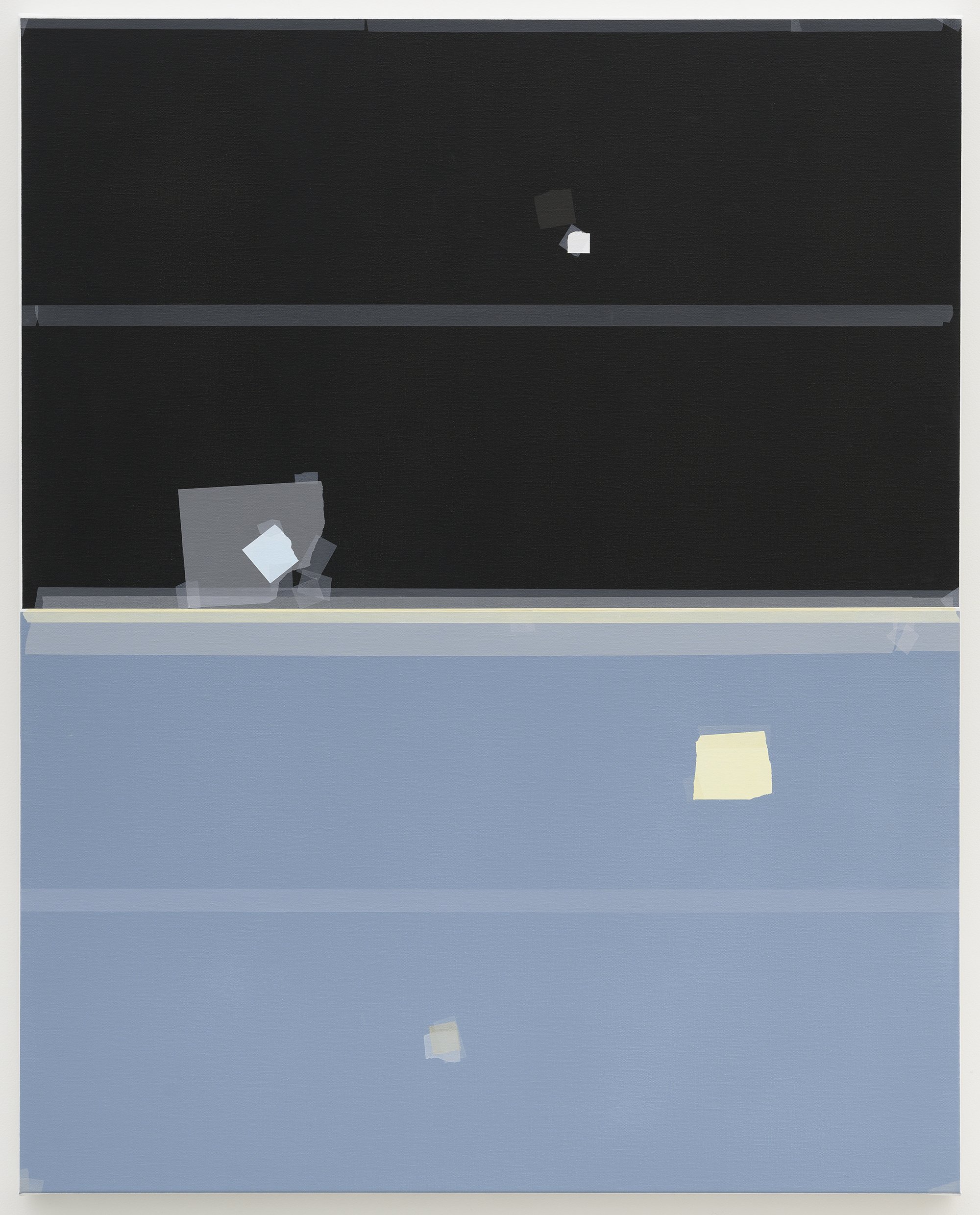
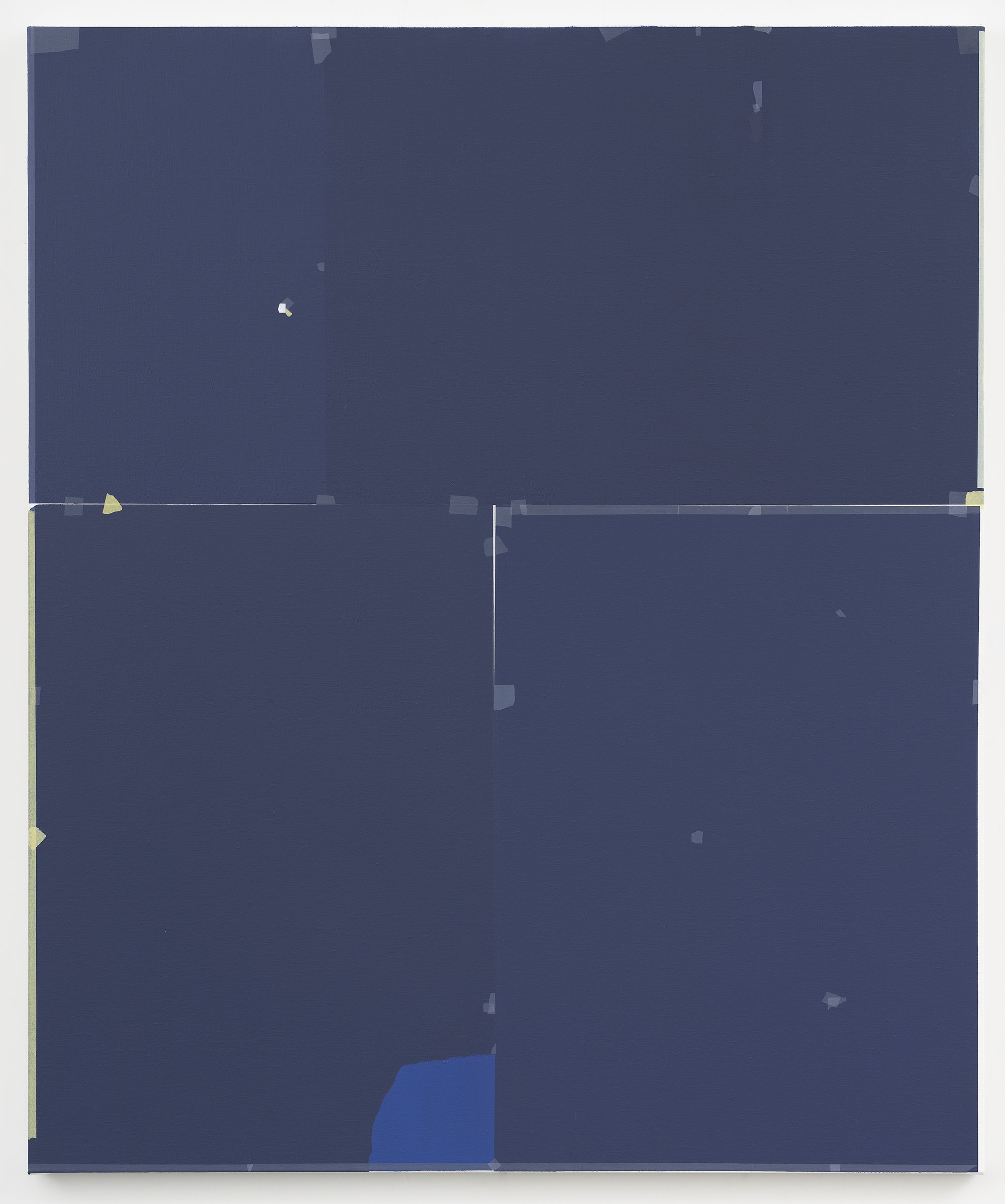
Various elements in a letter rack and back painting form analogies with Goudzwaard’s paintings. The letters are replaced by color papers, the tying threads are replaced by the sticking tapes. In a back painting, the back and thus the support of the painting, which is usually ignored by the viewer becomes the protagonist. The reversed role provides a humorous irony. In Study (Indigo) and Indigo shown in the current solo exhibition, a similar irony is present. In these two paintings, irregular units spread across the dark background. However, the seams between the dark areas reveal a white layer beneath. The real background as support is masked by the dark indigo color papers that disguise as the background. In a back painting, the support of the painting becomes the main subject while in Study (Indigo) and Indigo, the element that is supposed to be the main subject functions as the support.
After more than 300 years, in Leiden, one of the cities that thrived during the Dutch Golden Age, De Stijl was founded in 1917, with Theo van Doesburg, Piet Mondrian and Gerrit Rietveld as central members. De Stijl is a style featuring grids outlined with black lines and filled with primary colors. The style is practiced not only in paintings, but also in interior design, furniture, and graphic design. At the time, avant-garde artists believed that art should be the spiritual guidance of society and abstraction could be the universal language across countries. For a long time, abstract paintings and paintings that seek to represent the real world were regarded as total opposites, even antagonistic. However, by representing an abstract paper model which is a physical object that exists in the real world, Goudzwaard reconciles the two ideas of painting.
Copy and Original
As discussed in the introduction, Goudzwaard’s creative process involves two phases: composing the paper model and transferring the composition onto the canvas. The paper models remain at the painter’s studio. Only the painting would be exhibited. Without the opportunity to view the paper model, the audience has to imagine what the model looks like through the painting. In the experience of the audience, the painting seems to take up the role of the original, instead of being a copy. A closer look at Goudzwaard’s creative process reveals that the relationship between the model and painting does not conform to the dichotomy of the copy and original. Goudzwaard’s creative endeavor extends across the two phases.
In an interview with Nunu Fine Art, Goudzwaard talks about how he cares very much about the texture and quality of the papers and he does not acquire the papers randomly. When he starts to make a model, Goudzwaard would restrict the types of papers to be used. He does not want the endless possibilities created by the combination of unlimited papers to overwhelm himself. It is he, the painter who should be in control. The selection of colors and the design of the composition constitute the creative aspect of the first phase.
Likewise, creativity is manifested in various aspects during the second phase of transferring the composition onto the canvas. It is not a thoughtless mechanical process as it might appear. Various mental and physical efforts are required. As Goudzwaard mentioned, one of the big challenges for him is to control the colors to achieve ideal effects. Pigments behave differently. The paint that shows the same color as the color paper may demonstrate different levels of transparency on the canvas. The painter needs to experiment with mixing the right proportion of paints to recreate the visual quality of the color papers. In the second phase, the knowledge of the paints and the sensitive portrayal of colors are hard mental works that reflect the experience and skills of the painter.
Furthermore, Goudzwaard would reassess the composition in the second phase. If he feels the need to alter the composition, he would go back to the model to make changes and transfers the changes onto the canvas. The design of the composition does not end with the first phase but continues in the second phase. Finally, the neat finish and precise outlines depicting the cuttings and tearings of the paper and tape testify to the masterful control of the hand on the brush. The second phase is a time-consuming process. Both the control and time require strong will and consume the mental and physical energy of the painter. The judgments made on the design of the composition in the first phase and the fulfillment of the composition on the canvas in the second phase should be appreciated as artistic expressions. For Goudzwaard, both the model and the painting are equally important, “both images form an integral whole. Because the work process and the final image are a whole for me. As a maker, I am the happy owner of the memories and experiences during the working process. Both images are part of the same process, both made by myself, but each from its own, very specific attitude.”
Material and Space
As discussed in the previous section, the paper model remains an abstract concept for the audience. One has to imagine the model by looking at the painting. The painting, having the same composition as the model, becomes a surrogate for the model. Moreover, the model, being made of paper, a type of ephemeral material, accessible in everyday life, may deteriorate and break easily. Being transferred onto the painting, the paper model gains a permanent second life. Goudzwaard’s creative system merges the identities and existence of the two. The different natures between the material of the model and that of the painting dialogue with each other and generate layers of meanings.
In the paper model, multiple units are assembled on the same surface. The tape underlines the idea of an assemblage. The distinction between the parts and the whole is clear. In contrast, the painting is made up of layers of paint. The paint and the canvas are inseparable. The painting is an unbreakable and unified whole, while the cut color papers seem to be easily peeled off from the paper board. Moreover, as a unified entity, the painting is a physical object. In several works of this solo show, such as Study (black and blue), Study (Ephemeral), Bright Red -Transparency, and In Progress, long sections of tape are adhered along the upper and lower edges, and short sections are adhered over the corners. The sections of tape are like highlighting marks that draw the audience’s attention to the borders and the corners. As Goudzwaard said, the effect is to make the viewers aware of the painting as an object— a squared and three-dimensional object.
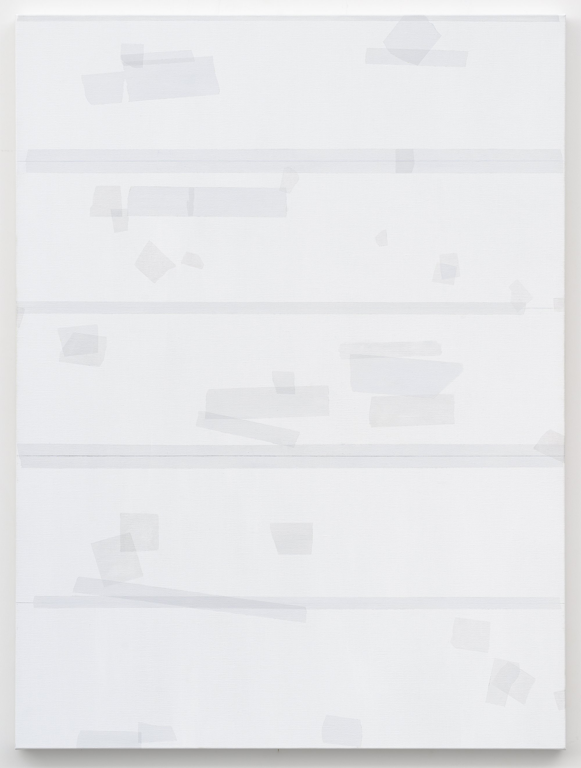
Besides the emphasis on borders and corners, in some compositions, sections of tape are stuck across the canvas from left to right, dividing the picture plane into horizontal slices of equal width. Goudzwaard divides the canvas with mathematical rationale, which effectively make the viewer aware of the proportion and scale of the canvas. Since the painting and the model are equal in size, the painted tape contains the same width as the tape in reality, unlike the cut papers that could be cut into various size and shape. The width of the tape is familiar to the audience. Therefore, the tape functions as a plotting scale for the viewer to judge the size and proportion of the painting. The tape lets the viewer relate to the tactile experience of using real tape and therefore feel the literal space occupied by the paintings.
Although the presence of the tape underlines the quality of the painting as an object, a painting is more often regarded as a two-dimensional image instead of a physical object. One of the pleasures of looking at the figurative painting is to appreciate the painter’s ability to depict three-dimensional space and objects convincingly on the flat surface of the canvas. Such a pleasure may also be experienced when looking at Goudzwaard’s paintings. In the paintings, the tape would twist and fold, and the papers and tapes overlap with each other. One understands that there are infinitesimal spaces in between the layers, and the layers build up small degrees of thickness, despite the lightness and transparency of the material. In addition to the literal space occupied by the painting, the tiny space in between and accumulated by the painted papers and tapes form the depicted space presented by the painting.
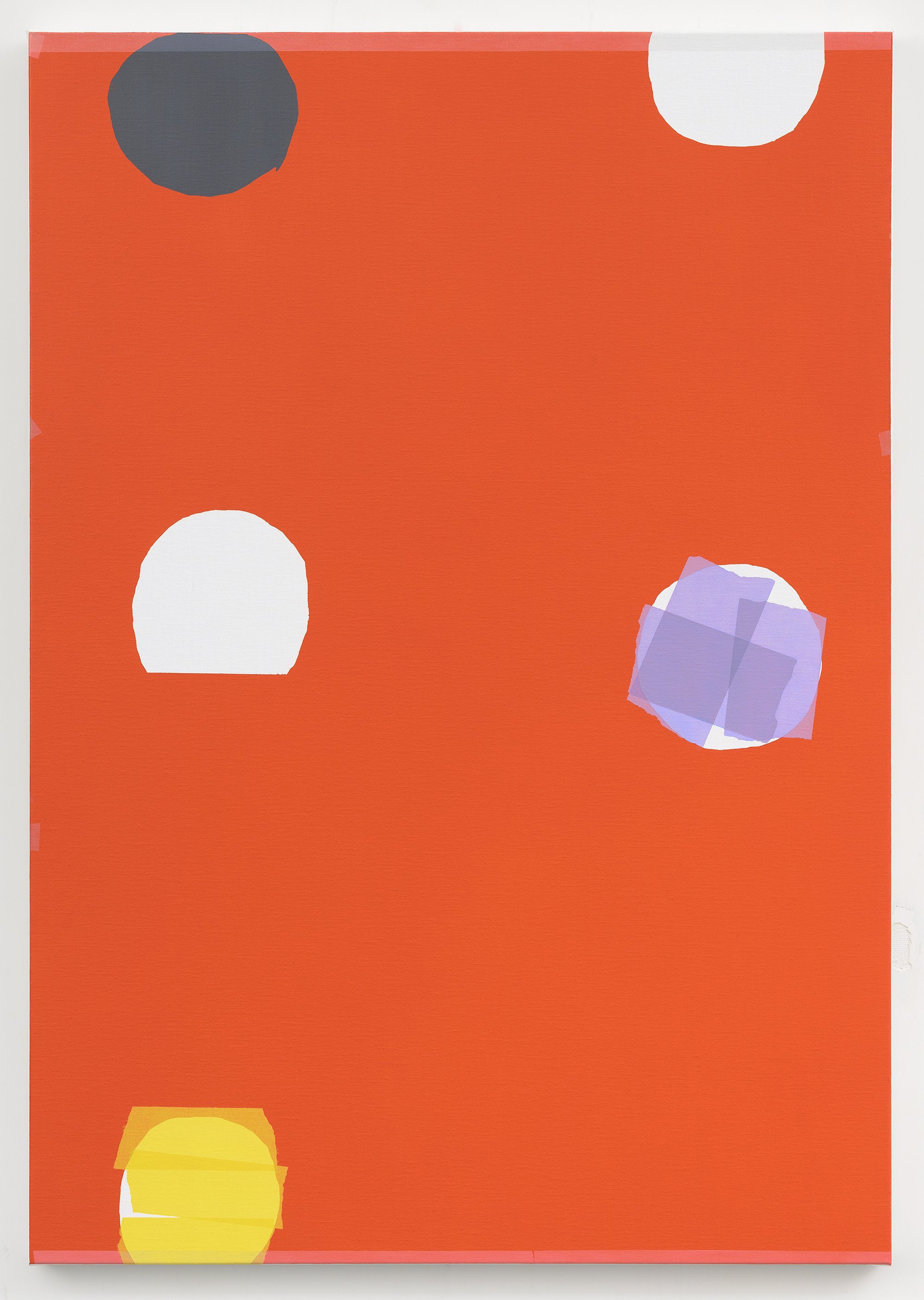
In addition to recognizing the painting as the representation of the paper model, the audience may intuitively recognize the painting as an abstract composition. Although pure shapes, colors and lines reject to form realistic space, the visual elements on the flat surface create the illusion of depth, motion, and weight. The abstract composition contains imaginary space. In Five Points on a Red Field, the palpating effect of the red makes the white circles like hollow holes that confine the smaller units of semi-transparent texture. In In Progress, the upper half of the composition is dominated by the rectangular transparent units that float in a stable condition. In contrast, the tilting transparent units in the lower half of the canvas seem to be falling. Fortunately, the bottom covered with a long section of tape provides the support, stopping the fall. The square at the left corner is stuck between the border and the rectangular unit. The tilting square at the right corner seems to just fall and bounce from the border, counterbalancing the downward movement of the rectangles above. Defining Green also plays with the balance of the rectangular units. The canvas is divided into four slices by transparent tape. The vertical units dominate the top and bottom slices and three vertical units are stationed along the mid-line. Several tilted units in the two middle slices challenge the order built up by the vertical units. One wonders if the vertical units would tame the tilted units or would the tilted units break the order formed by the vertical units. As Goudzwaard expresses, “each painting has its literal and its illusory weight. The colors create imaginary space and imaginary mass.” The eye takes an adventure in the imaginary space of the abstract composition; nevertheless, the trompe l’oeil depiction of the tape pulls the audience back to the reality. Looking at Goudzwaard’s painting, the viewers may travel through the literal, depicted and imaginary space.
Goudzwaard’s creative system involves distinct materials: paper, tape, paint and canvas. The different nature of the materials enables multiple interpretations, in which the tape plays a crucial role. The tape is the adhesive material that brings the units together in the paper collage. The obvious presence of the tape not only functions as part of the composition but also reminds the viewer that the units on the paper board are separate entities. In the painting, the tape makes the audience aware of the physical dimension of the painting, which is a squared three-dimensional object that occupies actual space. In addition to focusing on the physical presence and thus literal space of the painting, we can also focus on the depicted image of the painting. We can choose to let ourselves be deceived by trompe l’oeil, and ponder the space between and built up by layers of papers and tape as if seeing the real paper model. We can liberate ourselves from the confine of reality and focus on the imaginary space created by the abstract colors and shapes.
Text and Title
The multiple ways to understand the space of Goudzwaard’s painting are the result of the interaction of the visual and tactile sensations. The visual sensation discussed in the above section is related to seeing and looking. Furthermore, reading is another visual mechanism that can be applied to the interpretation of Goudzwaard’s painting. In the interview with Nunu Fine Art, Goudzwaard mentioned how graphic design and the printed matter had been his inspiration. He feels particular affinities with the works of the graphic designers Piet Zwart and Hendrix Wijdeveld. Goudzwaard was interested in “how a book page and a painting can be the same and different, and how one can read books on a painting, or read painting on a book.”
Goudzwaard has incorporated actual notebook pages in some of the early works. In recent years, Goudzwaard’s engagement with the text becomes less obvious; for example, Nursery Garden (2019) shown at the last solo exhibition at Nunu Fine Art is like a western musical score. In the current solo exhibition, some works also reflect the logic of reading texts. In four of the works, At Rest, In-between Space, Bright Red - Transparency and In a Corner, layered square color areas expand from the top left corners, which catch the eye immediately. The eye is likely to first observe the top left corner before moving to the single-colored backgrounds devoid of texture. Such movement of the eye resembles the experience of reading a text on a page, which also starts from the top left corner.
In addition to the rhythm and linear order, the proportion of the canvas is another aspect that relates Goudzwaard’s painting to a text. Some vertical compositions feel narrower than the regular paintings and resemble that of a page. The ratio of the height and the width of an A4 paper is the square root of two to one. (The height is approximately 1.414 times the width.) The proportions of the three paintings in this solo exhibition are close to that of the A4 paper: Five Points on a Red Field measures 100 by 70 centimeters (the height is approximately 1.42 times the width); Bright Red - Transparency measures 70 by 50 centimeters (the height is approximately 1.39 times the width); Study measures 39 by 28 centimeters (the height is approximately 1.39 times the width).
The compositions and the proportions of canvases may prompt the viewer to process the composition reading logic. The viewers might not recognize the connection between the paintings and texts but subconsciously relate to the reading experience. Furthermore, the titles of the paintings enrich the discussion on text and reading. To comprehend the title, the viewer commences the process of reading, and the information presented by the titles influences how the viewer interprets the paintings. Some titles of Goudzwaard’s paintings directly describe the visual elements in the works, while some are metaphorical. For example, Five Points on a Red Field points out that the composition contains five white circular openings on a red background. Study (black and blue) describes literally the two-color areas that divide the canvas in half. These two titles highlight certain features of the compositions. In contrast, the titles, At Rest and Ephemeral refer to the atmosphere and emotions.
Goudzwaard always takes time to give the paintings their titles. For him, “the identity and uniqueness of each individual image simply has to be confirmed. No drama or anecdote. And no moralism or slogans either.” The title offers a starting point for the viewers to commence their interpretations, but viewers do not have to be confined by the titles, “most titles provide a starting point from which to begin the journey through and across the surface of the image. So, by not directing too much in advance, I want to give the image and the viewer the opportunity to come together on their own terms and strength.”
History and Future
Goudzwaard’s paintings actively engage with the history of painting, 17th Century Dutch art and 20th Century abstract art. His creative system that involves two phases, creating the paper model and transferring the composition onto the canvas, reconciles the contradiction of representation and abstraction. Moreover, such a system challenges the dichotomy of copy and originality, both the model and the painting are the results of the artists’ creative endeavor. Goudzwaard works with various materials: paper, tape, paint and canvas. The interaction of the materials enables the painting to be understood as three-dimensional physical objects, as trompe l’oeil, and as abstract compositions that create imaginary space. The three layers of interpretations engage with both the visual and tactile sensation, and the tape plays a crucial role. The tape functions as the plotting scale to measure the space occupied by the painting in the physical reality and underlines the painter’s mastery in imitating the thin and transparent surfaces, reminding the viewers of the infinitesimal space between the papers and tape. Furthermore, Goudzwaard was interested in how a painting and a text may be similar and different. In contrast to the direct incorporation of texts into the paintings in his early works, the connection with text in the paintings has become much more subtle. The viewer does not need to recognize the connection at all; instead, the paintings subconsciously engage with the different mechanisms of reading and looking.
The above ways of looking at Goudzwaard’s paintings are based on the daily experience of cutting and sticking the paper and tape. In the digital age, people will probably use paper much less often.
Goudzwaard’s works may become an archeological evidence that testifies to the material culture lost with the advent of electronics. One wonders how the audience in the future sees Goudzwaard’s art. But basically, this is no topic for Goudzwaard while composing his paintings using paper and masking tape; for him, “visual materials may come and go. It is all about the energy, the space and rhythm of the color and lines that will keep on communicating.”
Artist

Kees Goudzwaard